

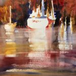
Sometimes It’s a New Color
I've been painting boats lately and started this watercolor in my usual way---- choosing composition, value pattern, shape, and color. Beginning with a vertical 14x11 piece of paper, I divided the design into 3 unequal parts: small sky, mid-size tree background, and...
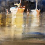
The Lost Edge
Once again I'm painting boats and using a palette with a warm dominance, perhaps in anticipation of nicer weather to come. My composition involves 3 layers and 3 values: light sky, dark background, and mid-tone water. The light/white boats were placed to show well...
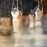
Dark Values
Achieving dark values is one of the hardest problems in watercolor. Two reasons: most of the colors are transparent, and then we add water which washes out the color. So how to get those juicy darks that contrast sharply with the white of the paper? One way is to add...